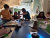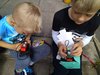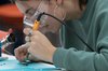
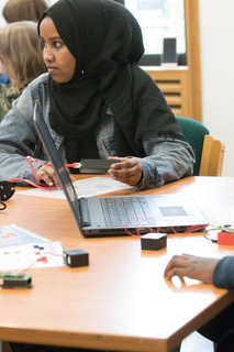
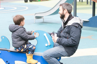
The Making Sense of Air Quality workshop for families during Leeds Digital Festival included time to explore the data collected with a mapping activity to build a digital story.
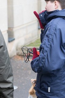
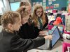
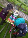
Transferring air quality and GPS data, collected on a walk around Roundhay Park, to Open Street Map gave families an opportunity to explore their route and question changes in readings along the way.
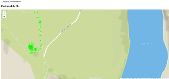
The GPS tracking is accurate enough to show movements around the playground close to Waterloo Lake and also to trigger conversations around the causes of spikes in particulate matter (PM 2.5 and 10). For some, it seemed like proximity of moving traffic might have been part of that data story, leading to further discussion about the benefits of images alongside future tracking and analysing of collected data.
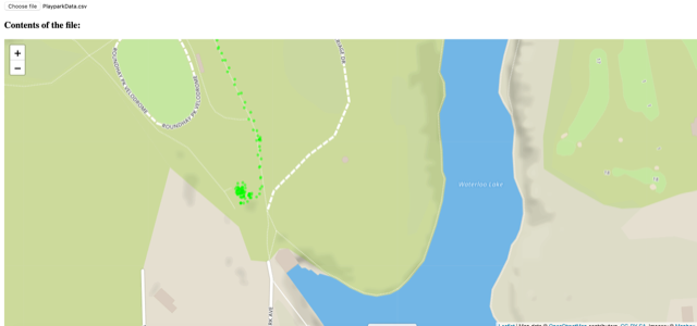
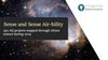
We'll share the link to the online map that will be populated with ongoing citizen science projects, but in the meantime you'll be able to identify the route from these 2 images at different scale.
The first algorithm draws a simple red, amber or green dot on the map depending on the data measured, according to DEFRA guidelines and health bandings.
Planned workshops in the programme will dig deeper into mapping and machine learning possibilities and give participants the chance to personalise visualisations and notifications.
Outdoor and active learning during @LeedsDigiFest to promote the health and wellbeing benefits of digital programmes. Monitoring #airquality to make data-driven decisions, change behaviours and improve the air around us.#Leeds #IoT pic.twitter.com/L3VQGbTYPH
— FDNdigicreate (@FDNdigicreate) April 27, 2019
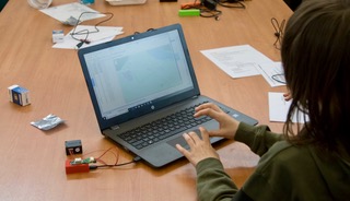
Tech list:
- GPS sensor available from Farnell
- Sensors attached to a TRIOT board but you could use a Raspberry Pi
- GitHub account for the Foundation for Digital Creativity has the files used for air quality.
- Download Mu Editor